Taylor demarco
Art stuff
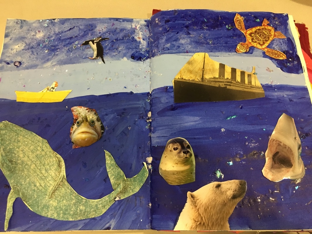 The process for this journal wasn't really planned. I started off with just painting the whole background blue and thought it looked a little funky. I added more colors of blue to make it look cooler and that's what happened. The bottom blue is suppose to be the ocean and the light middle blue is suppose to be the far background and the top blue is the sky. I added shiny scraps of glitter paper things to make it look sparkly. It looks like stars in the sky and it looks like the the water is sparkling. There's a turtle in the sky because it's suppose to be a star constellation :). There's a flying penguin too show that miracles do happen. The ship is the titanic and the little yellow boat is the person that escaped. The journal is telling the story of the titanic. The polar bear is the iceberg and all the other sea animals is suppose to represent the dangers of the sea.
1 Comment
 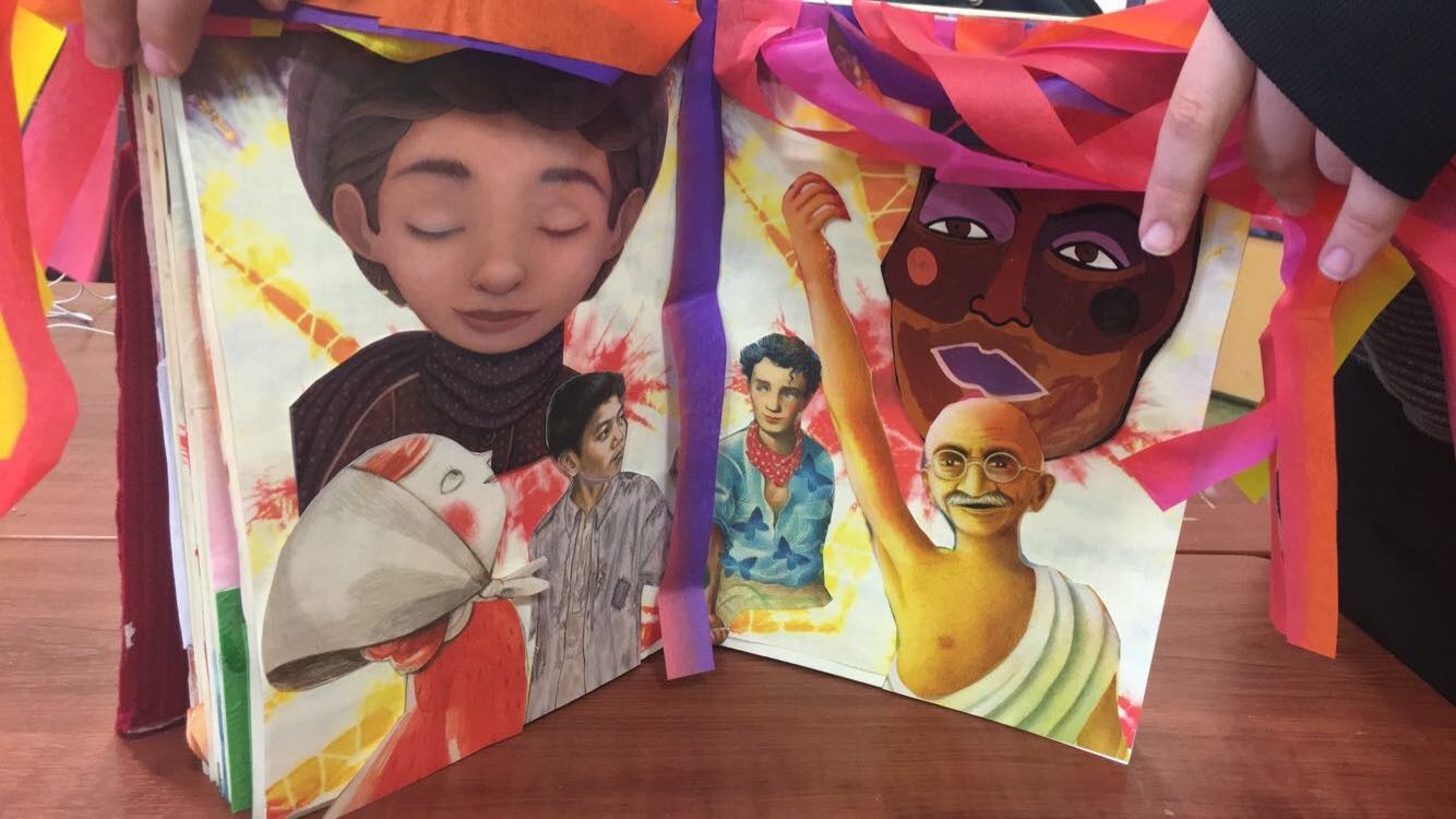 The process for this piece involved me cutting out people from different cultures that have different religions, morals, and lives all together. I put a fun and exciting background to show that these are more than just people. It made the cut outs of the people look more epic. I thought it looked like they were super heroes coming together to save the world. I also added the streamers of different colors to make it look like another curtain. I thought having it in a bunch of different colors would show that color is good and that it only makes life prettier. I thought this was a good piece because it speaks to the current events that are issues today. They are all different kinds of people in the world and no matter the color, they will always make the world a prettier place.
 The process to making this piece starts with me using water color to make the background. I used sweet colors and made the water drip down the page and then it started to look like a colorful cave. I added a rock near the corner of the page and put a sad little boy sitting on it. I also added a bunch of different hands or claws to represent monsters that is trying to get the little boy. The boy is just surrounded by monsters and the big monster on the other page was his friend. The little quote "Sometimes, a bad bye can feel like a good bye" is suppose to mean that the boy is saying good bye to his monsters and is going to move on to the better things in life. The colorful background and light colors is suppose to make the cave look pretty and safe, but the color blue is key because it is suppose to represent sadness.
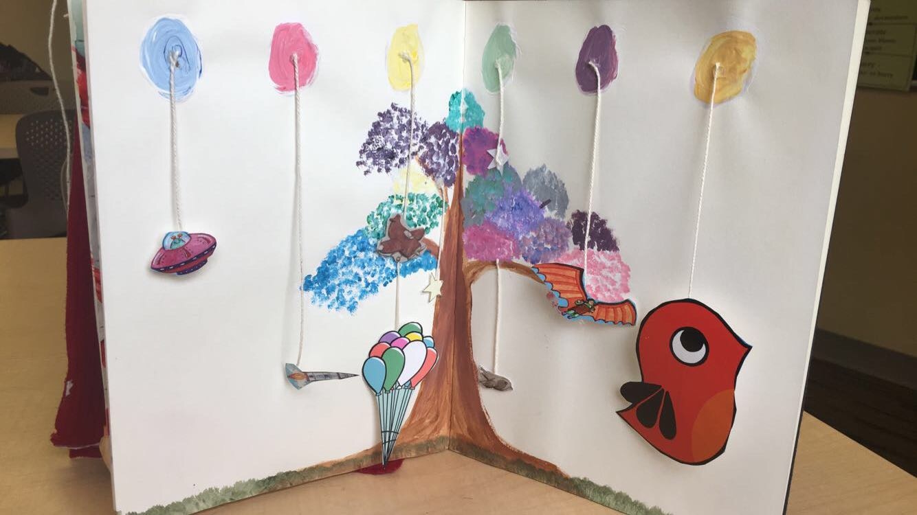 In the beginning of this piece, I wanted to make it look really pretty and colorful, but I ended up doing something completely different. I decided to make this piece like a day dream. I left the background white because it can be left up to interpretation about what happens in the dream. The tree represents the brain and the different parts that can come from it. The little balls at the top is suppose to represent different ideas that are on the tree. I used acrylic paint to make the tree and the balls. I also mixed paints to make the leaves in the tree because some ideas clash together to make something pretty. The little flying objects attached to string all have something in common, which is that they are all objects that fly. Ideas are always flying around in our head and I thought it was a creative way to show ideas.
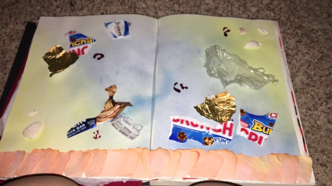 The process I took to make is was by starting off with the background. I used chalk and made it look like a little beach thing. I later added the little flower petals to make it look like the sand part and it's part of the nature theme. I used seashells to make the beach/ocean scene look more realistic. I thought it really added to it because it's real. I added the trash to represent the actual trash that is in the ocean. I thought it was a thoughtful idea because it's a real problem that we face. The trash in the piece ruins the pretty things and that is how it is in the real world. Ugly things are destroying the beauty that we have. I also added splatters of red in different areas to represent the blood or the death that is happening in the ocean due to our trash floating in the sea. It's suppose to be the fish. This piece didn't take long to make and it conveys a powerful message.
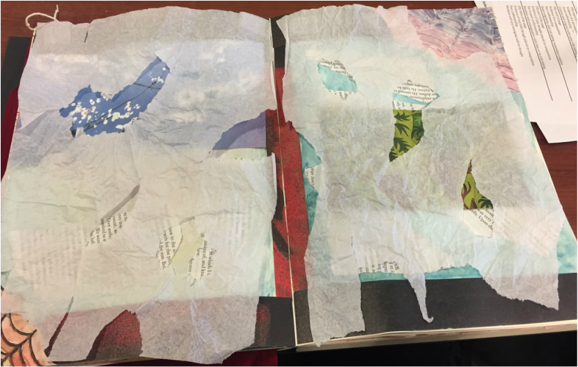 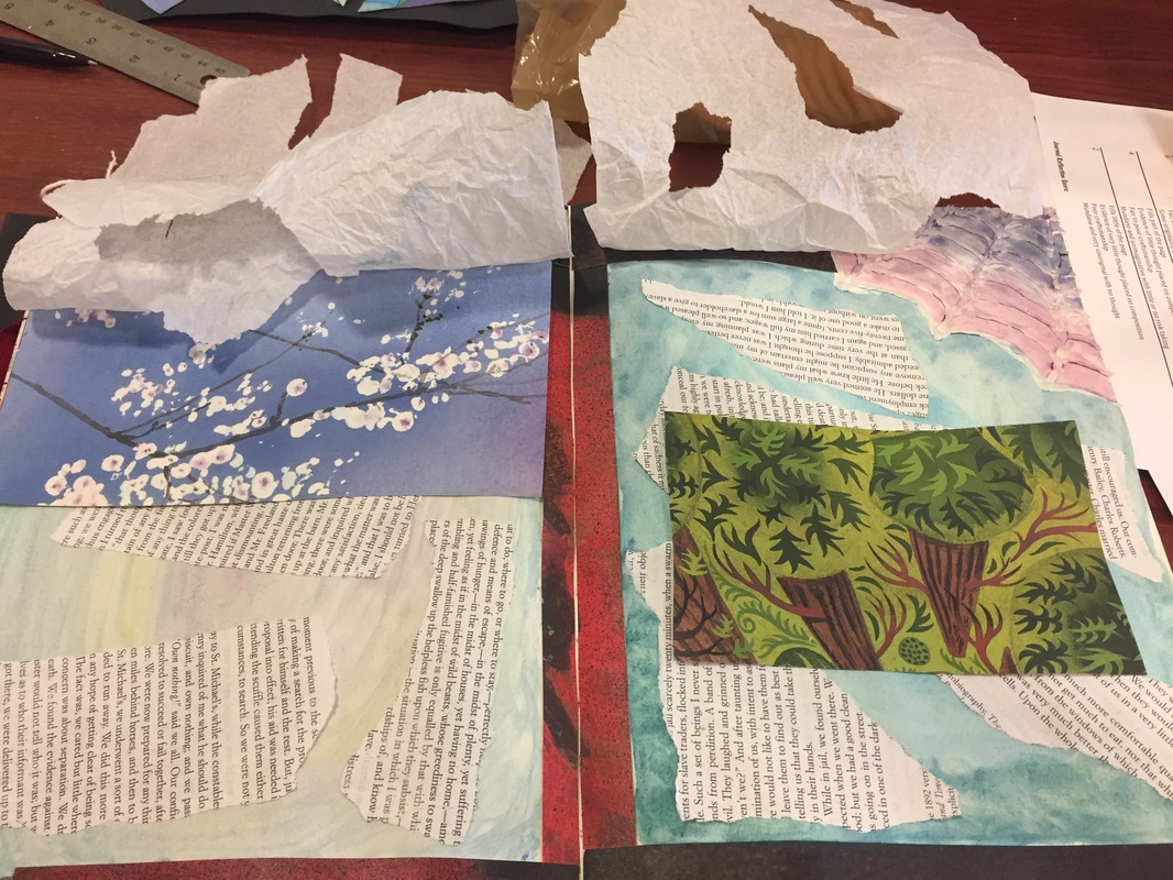 When I started making this piece, I wanted it to be like windows and with a nice view, but then I messed up and it became an ocean view because of the colors. The webs in the corners are suppose to make the piece seem older, but that's not the feeling I'm getting from it. The borders are suppose to be the window seal and the dark colors are suppose to make more of a darker feeling, but it's not dark. I think I should've done a different background, but I actually like the colors. The background is light and blue like the ocean. I wanted it like that because I wanted some type of ourdoor scene that was looking out. I also made thin curtains that was all ripped and full of holes so that it added to the old and scare feeling. I have ripped out paper from a book and pasted it all around and thought it was a good idea because it's suppose to represent the wind. The cut out pictures of the trees is suppose to be other scenes of nature because I wanted to make it look like there's more to it.
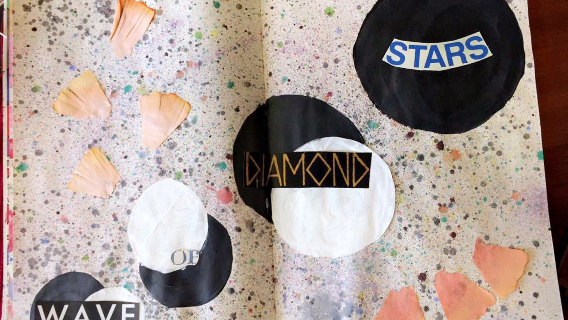 The process for making this involved me needing to put cut out circles in a diagonal order and then spray watercolor all over the place to make it look like space or stars. I think a little bit of both. I later decided to color in the circles with black paint. I also decided that that wasn't enough, so I added the white moon to make it stand out a little more. I added the flower petals because I like how they look on the paper. I also like that it makes it more 3-D. The words "Wave of diamond stars" is suppose to go with the theme of the piece. Space and stars surround the moons, so I thought that the words in the moons would look cool.
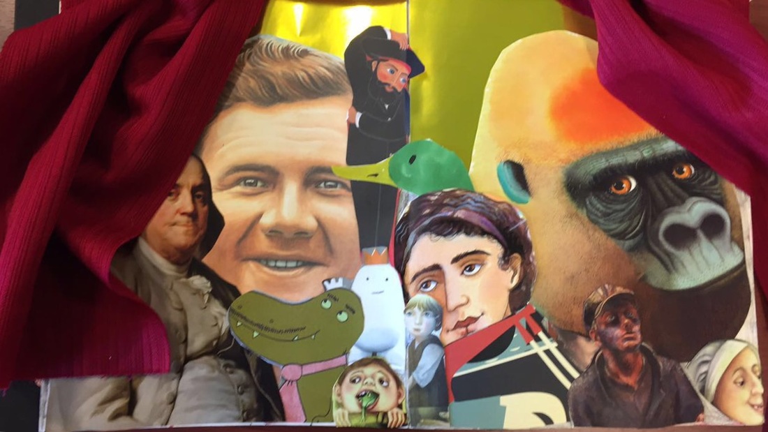 The process for making this a difficult but easy at the same time. Making the curtains was a struggle because I couldn't quite figure out how to make the holes in the fabric and have it move. I used a protractor to make the holes. I would stab the fabric with it and then I would slide the string through it. After that, I hot glued the curtain to the paper on the corners. The gold background represents fame. The cutouts of the people/animals represent those that have been known for something. Babe Ruth is a good example because he was very well-known. I just placed the pictures in certain areas so that it covers all the white space.
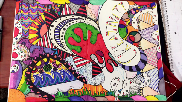 So this picture is really blurry. This picture symbolizes my creativity; it is completely random and all over the place. They very in different shapes, colors, etc. Majority of the colors are bright because they represent my positive attitude but there are aspects of darkness to show my dark side. There are certain parts I like in this piece such as the fan because it symbolizes my heritage. Overall, this visual piece represents my train of thought and explains how I go about the rest of my art pieces. I spent most of my time trying to figure out what unique things I can add to this last night. I had a difficult time trying to choose the right colors for the different parts of the piece and I was also limited to the use of colors in my journal. I didn't have many colors with me at the time so I just worked with what I had.
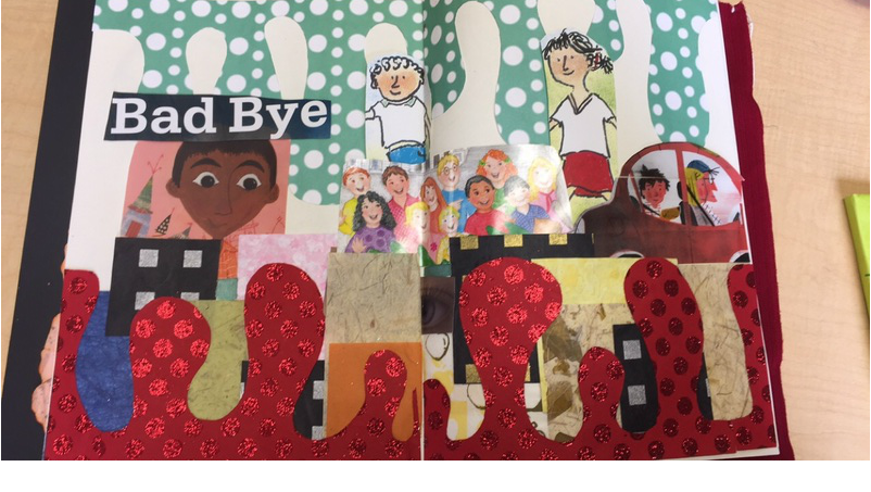 So at first I was going to make a city with the droopy things at the top and bottom to show that the city is mess or something, but it was too much work so I just put a bunch of creepy kids to make it look like it was a good bye. The words "bad bye" is showing that everyone is leaving that kid. The blocks represent the city and that was suppose to be part of my other plan, but it still works for my new one. It's a city kid and all his friends leave him. I wish I added more background for the piece. I enjoy using parts of book covers to make new things because I find it interesting that anything can be done by just using the pictures and words off book covers. I probably will add more to the background later (maybe), I kind of like the contrast with the green drops and the white because it makes it look better.
|
TAYLORMRS. NELSON |
 RSS Feed
